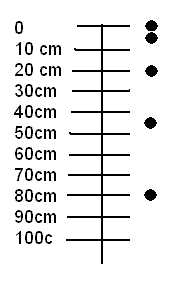
The velocity of a falling object increases the longer it falls, and this
determines how far it goes in the next time interval. The picture shows the
position of a dropped ball at 0.1 sec, 0.2 sec, 0.3 sec, ... .
The ball positions cluster together at the beginning, but then get farther
apart, because the ball is going faster and faster downward.
Another way to show this kind of information is to make a graph of
the position of the ball as a function of time.
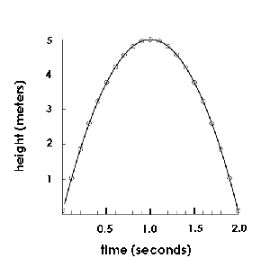
This graph describes a ball that is thrown upward so that it rises 5 meters
before it falls down again.
It takes one second to get to its highest point, and another second to
return to the ground. On the way up, it goes less far in each successive
second: it is slowing down. On the way down, it goes farther in each
successive second: the speed is increasing.
If we measure position in the upward direction (as in this graph),
the upward velocity could be represented by positive numbers and
the downward velocity could be represented by negative numbers.
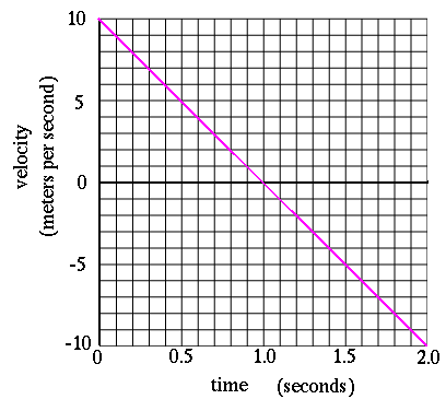
The graph of velocity as a function of time is a straight line
for this case.
It starts with positive numbers (the ball is going up) and ends with negative
numbers (the ball is going down).
Here are some examples for you to consider:
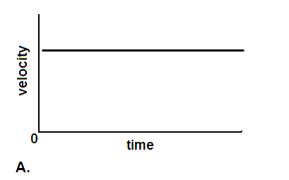
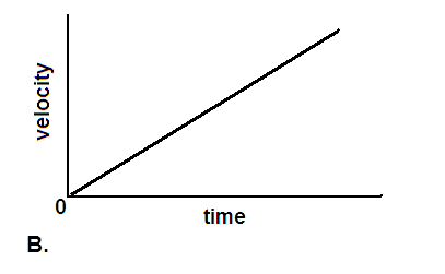
This graph shows how a ball behaves on a piece of track, in a particular experiment.
Explain how the ball and track system could have been set up to produce this graph.
 The velocity of a falling object increases the longer it falls, and this
determines how far it goes in the next time interval. The picture shows the
position of a dropped ball at 0.1 sec, 0.2 sec, 0.3 sec, ... .
The ball positions cluster together at the beginning, but then get farther
apart, because the ball is going faster and faster downward.
The velocity of a falling object increases the longer it falls, and this
determines how far it goes in the next time interval. The picture shows the
position of a dropped ball at 0.1 sec, 0.2 sec, 0.3 sec, ... .
The ball positions cluster together at the beginning, but then get farther
apart, because the ball is going faster and faster downward.
 The graph of velocity as a function of time is a straight line
for this case.
It starts with positive numbers (the ball is going up) and ends with negative
numbers (the ball is going down).
The graph of velocity as a function of time is a straight line
for this case.
It starts with positive numbers (the ball is going up) and ends with negative
numbers (the ball is going down).