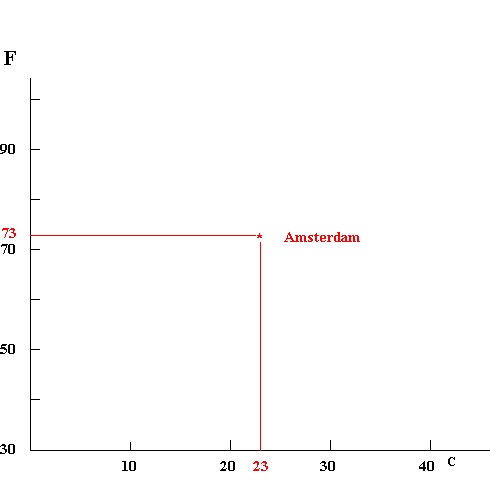
Repeating this process for each city gives a set of dots.
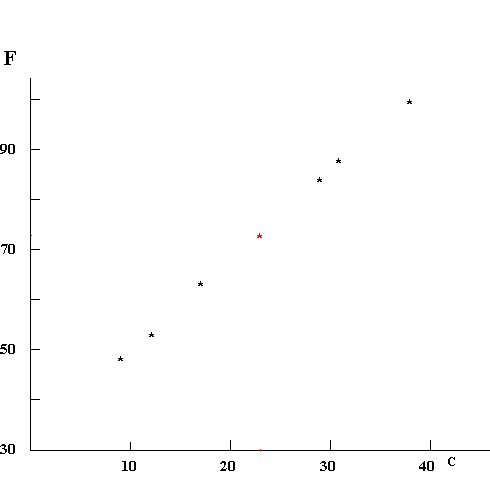
It's possible we would have to stop here. For example, if you represent the height and weight of all the students in your school by dots, there will just be a cloud -- the taller students may also be heavier, but there will be enough short round people and tall thin ones that no strong pattern emerges. But in the case of the "F" and "C" data we see a strong relationship -- in fact, we can draw a line that goes very close to all of them.
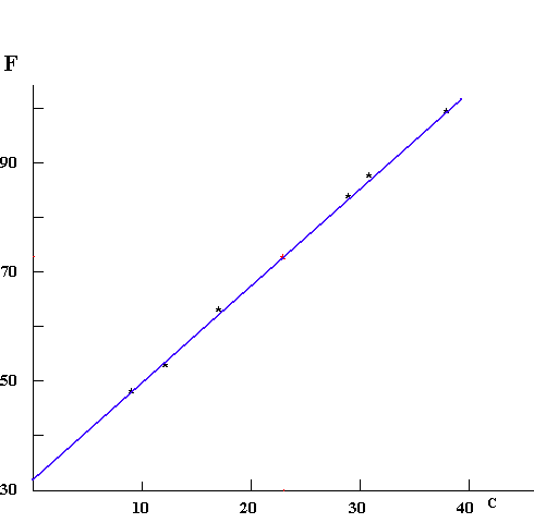
This line is very interesting, because it proposes that there is a relationship that goes beyond the data at hand. It predicts that if we ever find a city where the "F" value is 41, the "C" value will be 5.
The line appears to be straight, and for this example it should be. However, we should realize that over short ranges of data, a smooth curve may look straight even though it really isn't. Going beyond the range for which data is available can be dangerous for this reason.
When you make line graphs of data you have taken, they might not look as pretty as this. Sometimes it is hard to read the measuring apparatus accurately; sometimes you read the number wrong or wrote it down incorrectly or misplotted the point. Making a line graph is a good way of discovering errors of this sort. However, if you are careful in measuring, you should have confidence in your data; don't assume that the line has to be straight or smooth. In the end, what you have measured is reality; if it looks differently than you expected, it may mean that your expectations were wrong, or that what you measured differs in some way from what you thought you were measuring. Graphs that "do the wrong thing" can be very interesting, because they hint at a way that nature is different from our understanding of it.
Happy graphing! To help, we include three pieces of graph paper that you can print out and use. 10 x 10 15 x 15 20 x 20
Graphs can also be constructed using Microsoft Excel. Click here for an example with brief explanation (this action is supposed to open the file tgraph.xls on the CD).
Hit the "back" key