Making line graphs A line graph is a way to represent a relationship between two
lists of numbers. For example, here is a list of the
temperatures in various cities. There are two columns, labelled
"F" and "C", and we might wonder how they are related.
City
F
C
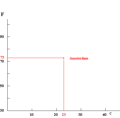
Amsterdam, Netherlands
73
23
Atlanta, USA
88
31
Dhahran, Saudi Arabia
100
38
Moscow, Russia
48
9
New Delhi, India
84
29
Sydney, Australia
53
12
Vladivostok, Russia
62
17
A first step in finding a relationship between the columns is
to represent each city by a dot on a graph.
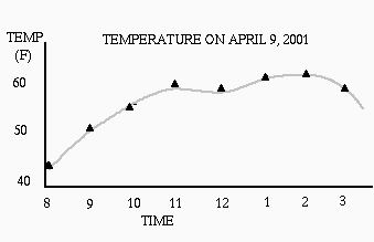
The usual convention is to put the variable that is being
controlled on the horizontal axis, and the response on the vertical
axis. A common example would be a graph showing how the
temperature varied throughout a school day.
Here time is on the horizontal axis (we can't
control time, but it
controls everything else), and the temperature
on the vertical axis.
In the C and F problem, we can chose our axes
any way we like, since we don't know which is "cause" and which is
"effect." (This example is a little unusual, in that the data is
given in an order that has nothing to do with the C or F values.
This doesn't prevent us from looking for a relationship between C and F).
So let's choose the
horizontal axis to be the "C" value and the vertical axis is the "F"
value. Here's what this looks like for Amsterdam:
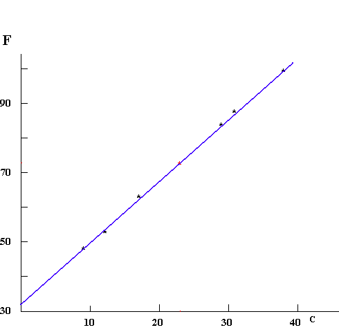
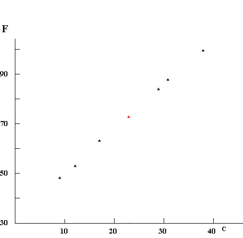
Repeating this process for each city gives a set of dots.
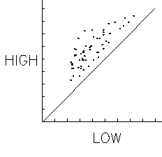
It's possible we would have to stop here. For example, if you
were to graph the high and low temperatures at each city this way,
you would just get a cloud of dots.
The two values do tend to go up and down together, but no
strong pattern emerges.
However, in the case
of the "F" and "C" data we see a strong relationship -- in fact,
we can draw a line that goes very close to all of them.
Note that I have drawn a single line, rather than many segments
that connect the dots. This means that I think there is a simple
relationship (the line) and that the data may be slightly inaccurate
for some reason (in the present case, they have been rounded off to the
nearest degree). It generally is proper to draw the smooth curve that
goes near the points in preference to a bumpy one that goes right
through them.
The line is very interesting, because it
proposes that there is a relationship that goes beyond the data
at hand. It predicts that if we ever find a city where the "F"
value is 41, the "C" value will be 5.
The line appears to be straight, and for this example it
should be.
However, we should realize that over short ranges of data, a smooth curve
may look straight even though it really isn't. Going beyond the
range for which data is available can be dangerous for this
reason.
When you make line graphs of data you have taken, they
might not look as pretty as this. Sometimes it is hard to read
the measuring apparatus accurately; sometimes you read the
number wrong or wrote it down incorrectly or
misplotted the point. Making a line graph is a good way of
discovering errors of this sort. However, if you are careful
in measuring, you should have confidence in your data; don't
assume that the line has to be straight or smooth. In the
end, what you have measured is reality; if it looks
differently than you expected, it may mean that your
expectations were wrong, or that what you measured differs
in some way from what you thought you were measuring. Graphs
that "do the wrong thing" can be very interesting, because
they hint at a way that nature is different from our
understanding of it.
Happy graphing! To help, we include three pieces of graph paper
that you can print out and use. 10 x 1015 x 1520 x 20
Graphs can also be constructed using Microsoft Excel. Click
here for an example with brief explanation.
Hit the "back" key
 It's possible we would have to stop here. For example, if you
were to graph the high and low temperatures at each city this way,
you would just get a cloud of dots.
The two values do tend to go up and down together, but no
strong pattern emerges.
It's possible we would have to stop here. For example, if you
were to graph the high and low temperatures at each city this way,
you would just get a cloud of dots.
The two values do tend to go up and down together, but no
strong pattern emerges.